---
marp: true
theme: gaia
paginate: true
backgroundColor: #fff
header: "Web Engineering – DHBW Stuttgart"
footer: "Michael Czechowski – SoSe 2026"
title: HTML & CSS
---

# Web Engineering
**DHBW Stuttgart** · Informatik / Wirtschaftsinformatik
**Sommersemester 2026** · Sitzung 2 — HTML & CSS
[https://librete.ch/dhbw/](https://librete.ch/dhbw/)
---

---
# Ressourcen zum Selbstlernen
- **CODE CRISPIES** — [codecrispi.es](https://codecrispi.es/)
- **Online Code-Editor** — [codepen.io](https://codepen.io/pen/)
- **MDN** (Mozilla Developer Network) — [developer.mozilla.org/de/](https://developer.mozilla.org/de/)
- **Flexbox-Spiel** — [flexboxfroggy.com](https://flexboxfroggy.com/)
- **Grid-Spiel** — [cssgridgarden.com](https://cssgridgarden.com/)
# HTML – Hypertext Markup Language
---
# Was ist HTML? (1/2)
**H**yper**T**ext **M**arkup **L**anguage
- **Keine** Programmiersprache
- Am ehesten eine Formattierungssprache
- Beschreibt **Struktur und Aufbau** einer Webseite
```html
Das ist ein Absatz.
```
Erfunden 1989 von Tim Berners-Lee. Aktuelle Version: HTML5 (seit 2014).
---
# Was ist HTML? (2/2)
- Mit HTML werden **HTML-Dokumente** beschrieben (`index.html`)
- Ein HTML-Dokument beschreibt das **Document Object Model (DOM)**
- Der DOM ist eine **hierarchische Baumstruktur** (Eltern, Kinder, Geschwister)
- *parent* nodes / elements
- *child* nodes / elements
- *sibling* nodes / elements
In HTML sprechen wir von **Elementen**, in JavaScript eher von **Nodes**.
---
# HTML-Anatomie (1/2)
```
Opening tag Closing tag
│ │
▼ ▼
My cat is very grumpy
└────────┬─────────┘
Content
└─────────────────────────────────┘
Element
```
- **Opening tag** + **Content** + **Closing tag** = **Element**
- Öffnende und schließende Tags müssen identisch sein
- Schließendes Tag hat ein `/` nach der Spitzklammer
---
# HTML-Anatomie — Attribute
```
Attribute
┌───────────────┐
My cat is very grumpy
```
- **Attribute** stehen im opening tag
- Format: `name="wert"` (Anführungszeichen empfohlen)
- Mehrere Attribute durch Leerzeichen getrennt: ` `
---
# HTML-Anatomie (2/2)
Wir unterscheiden **umschließende** und **selbst-schließende** Tags.
**Umschließend:**
- ` ... ` – fett-gedruckter Text (inline)
- ` ... ` – Hyperlink
- ` ... ` – sichtbarer Teil eines HTML-Dokuments
- ` ... ` – Aufklapp-Text / Akkordion
**Selbst-schließend:**
- ` ` – Bild, Vektorgrafik
- ` ` – Eingabefeld
- ` ` – Metadaten
---
# Darstellungsebene und Metadaten
```html
METADATEN
DARSTELLUNGSEBENE
```
Ein HTML-Dokument besteht aus zwei Teilen:
- ` ... ` – Metadaten für Browser, Suchmaschinen, Social Sharing
- ` ... ` – darzustellender Inhalt, Text, Formulare
---
# HTML Metadaten
```html
DHBW Stuttgart
...
```
*Webseiten besuchen nicht nur Menschen, sondern auch Suchmaschinen, Bots, Screen-Reader. Metadaten helfen beim "Verstehen" der Inhalte.*
---
# HTML Metadaten – Vertiefung
| Tag | Funktion |
|-----|----------|
| `` | Browser-Tab, Suchergebnis-Titel |
| ` ` | Zeichenkodierung (Umlaute!) |
| ` ` | Mobile Darstellung |
| ` ` | Suchergebnis-Snippet (max 160 Zeichen) |
**Open Graph** (Social-Media-Vorschau):
```html
```
→ Wirkt auf Mastodon, LinkedIn, Signal, Slack, MS Teams ...
**SEO:** Google nutzt `` + ` ` für Ranking + Snippet.
---
# HTML-Tags und Attribute

```html
Das ist ein wichtiger Absatz.
Das ist ein gewöhnlicher Absatz.
```
| Teil | Bezeichnung |
|------|-------------|
| `` | Opening Tag |
| `class="wichtig"` | Attribut |
| `Das ist ein wichtiger Absatz.` | Inhalt |
| `
` | Closing Tag |
---
# HTML-Tags und Attribute (selbst-schließend)
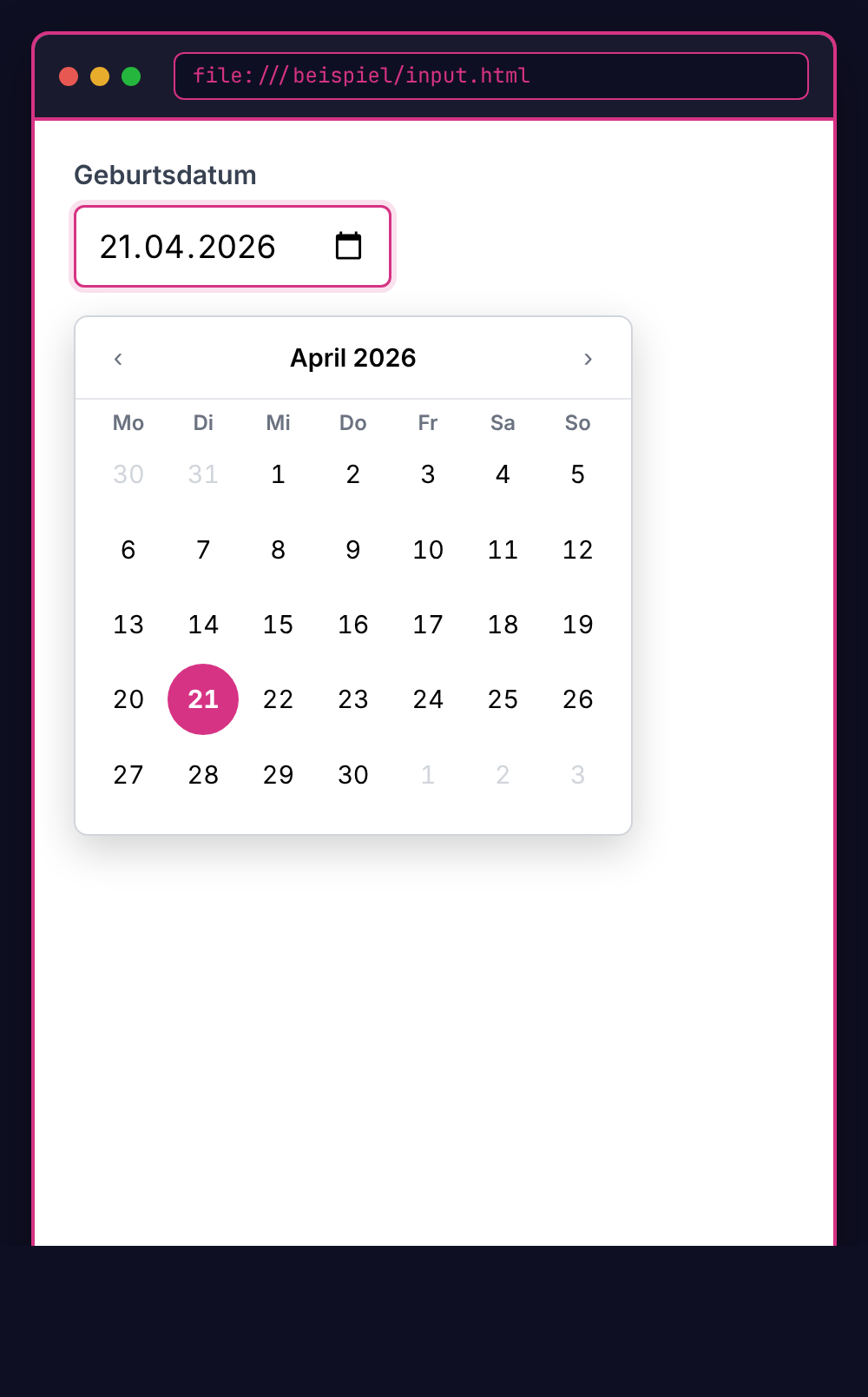
```html
Geburtsdatum
```
| Teil | Bezeichnung |
|------|-------------|
| ` ` | Schließendes `/` im (öffnenden) Tag |
---
# Vollständiges Grundgerüst
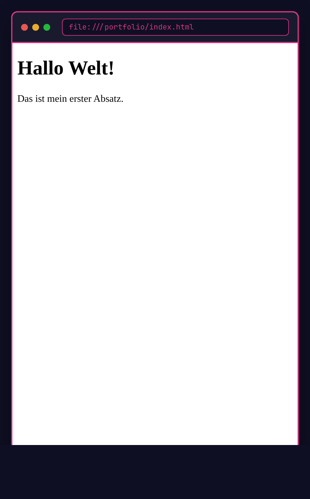
```html
Portfolio von ...
Hallo Welt!
Das ist mein erster Absatz.
```
---
# Die wichtigsten Tags
| Tag | Bedeutung |
|-----|-----------|
| `` … `` | Überschriften (h1 = größte) |
| ` ` | Absatz (Paragraph) |
| ` ... ` | Hyperlink |
| ` ` | Bild |
| `
`, ``, `` | Listen |
| `` | Container / Box |
| `
` | Inline-Container |
| ` ` | Eingabefeld |
Semantische Tags (``, ``, ``, ``, ``, ``) wichtig für Accessibility.
---
# Natives HTML
Was früher mit JavaScript gelöst wurde, kann HTML heute selbst. JS dafür einzusetzen ist heute oft ein **Code Smell**.
| Funktion | HTML-Element |
|----------|--------------|
| Aufklapp-Text | `` + `` |
| Popup / Modal | `` |
| Fortschrittsbalken | `` |
| Datum-Auswahl | ` ` |
| Validierung | Attribute: `required`, `min`, `max`, `pattern` |
---
# Beispiel: Details/Summary
*Akkordion · Accordion · Aufklappmenü · Collapsible*

```html
Klick mich!
Dieser Text ist versteckt.
```
Doku: [developer.mozilla.org](https://developer.mozilla.org/de/docs/Web/HTML/Reference/Elements/details)
---
# Beispiel: Details/Summary (geöffnet)

```html
Klick mich!
Dieser Text war versteckt.
```
---
# Beispiel: Button

```html
Add to favorites
```
Doku: [developer.mozilla.org](https://developer.mozilla.org/de/docs/Web/HTML/Reference/Elements/button)
---
# Beispiel: Input/Eingabefeld

```html
```
Doku: [developer.mozilla.org](https://developer.mozilla.org/de/docs/Web/HTML/Reference/Elements/input)
---
# Beispiel: Dialog
*Modal · Modales Fenster · Popup · Overlay · Dialogfenster*

```html
Greetings, one and all!
```
Doku: [developer.mozilla.org](https://developer.mozilla.org/de/docs/Web/HTML/Reference/Elements/dialog)
---
# Barrierefreiheit
## Accessibility (a11y)
---
# Wie nutzen Menschen das Web?
| Eingabe | Nutzungsweise |
|---------|---------------|
| **Maus** | Klicken, Scrollen |
| **Tastatur** | Tab-Navigation, Enter, Pfeiltasten |
| **Screenreader** | NVDA, VoiceOver, TalkBack, Orca |
| **Sprachsteuerung** | "Klicke auf Anmelden" |
| **Augensteuerung** | Eye-Tracking |
| **Switch-Geräte** | Ein-/Aus-Schalter (motorische Einschränkungen) |
→ Nicht alle Menschen nutzen Maus oder Touchscreens gleichermaßen.
---
# Web-Zugänglichkeit — Statistik
WHO: ca. **15 % der Weltbevölkerung** mit Behinderung — über **1 Milliarde** potenzielle Nutzer:innen.
| Typ | Permanent | Temporär | Situativ |
|-----|-----------|----------|----------|
| Visuell | Blindheit | Augen-OP | Grelle Sonne |
| Motorisch | Amputation | Gebrochener Arm | Kind auf dem Arm |
| Auditiv | Taubheit | Ohrenentzündung | Laute Umgebung |
| Kognitiv | Legasthenie | Müdigkeit | Ablenkung |
**Curb-Cut-Effekt:** Bordsteinabsenkung für Rollstühle hilft auch Kinderwagen, Rollkoffern, Fahrrädern.
---
# Warum Barrierefreiheit?
**Rechtlich (DE / EU):**
- **EAA** — European Accessibility Act, in Kraft seit 28.06.2025
- **BFSG** — DE-Umsetzung des EAA, betrifft auch Privatwirtschaft
- **BITV 2.0** — Barrierefreie Informationstechnik-Verordnung (öff. Stellen)
- Bußgelder bis **100.000 €**
**Ethisch:** Teilhabe und digitale Inklusion.
**Praktisch:**
- Bessere UX für **alle** (mobile, ältere Menschen, situative Einschränkungen)
- SEO-Bonus durch semantisches HTML, Alt-Texte
- Größerer Markt — ca. 15 % der Bevölkerung
---
# WCAG: Der Standard
**W**eb **C**ontent **A**ccessibility **G**uidelines · Herausgeber: W3C / WAI
**Aktuell:** WCAG 2.2 (verbindlich seit Okt. 2023). WCAG 3 in Working-Draft.
**4 Prinzipien (POUR):**
| Prinzip | Bedeutung |
|---------|-----------|
| **P**erceivable | Wahrnehmbar — Inhalte müssen erkennbar sein |
| **O**perable | Bedienbar — Funktionen müssen nutzbar sein |
| **U**nderstandable | Verständlich — Inhalte müssen klar sein |
| **R**obust | Robust — funktioniert mit verschiedenen Technologien |
**Konformitätslevel:** A · **AA** (gesetzlicher Standard) · AAA
→ [w3.org/WAI/WCAG22/quickref](https://www.w3.org/WAI/WCAG22/quickref/)
---
# Perceivable: Wahrnehmbar

**Texte:**
- **Kontrast:** mindestens 4,5:1 für normalen Text
- **Untertitel** für Videos
- Inhalte bei **200 % Zoom** noch nutzbar
**Textalternativen für Nicht-Text:**
```html
```
→ Leeres `alt=""` für rein dekorative Bilder.
---
# Operable: Bedienbar

**Tastaturzugänglich:**
```css
/* Fokus-Ring nur bei Tastatur-Navigation */
button:focus-visible {
outline: 3px solid #d63384;
outline-offset: 3px;
border-radius: 4px;
}
/* Anti-Pattern */
button:focus { outline: none; }
```
**Genügend Zeit:** Session-Timeouts ankündigen, Verlängerung ermöglichen.
**Kein Flackern:** maximal 3×/Sekunde (epileptische Anfälle vermeiden).
---
# Understandable: Verständlich

**Sprache angeben:**
```html
```
**Konsistente Navigation** — gleiche Elemente an gleicher Stelle.
**Fehler erklären:**
```html
Bitte eine gültige E-Mail-Adresse eingeben.
```
---
# Robust: Technisch solide

**Semantisches HTML:**
```html
Klick mich
Klick mich
```
**ARIA — nur wenn nötig:**
```html
Schuhe
Jacken
```
→ Erste ARIA-Regel: **wenn möglich, natives HTML nutzen**.
---
# Barrierefreiheit testen — Werkzeuge
**Automatisierte Tools** (finden ca. 30 % der Verstöße):
| Tool | Typ | Findet |
|------|-----|--------|
| [WAVE](https://wave.webaim.org/) | Browser-Extension | Kontrast, Struktur, Tab-Reihenfolge |
| [Lighthouse](https://developer.chrome.com/docs/lighthouse/overview) | Chrome DevTools | Performance + A11y-Audit |
| [axe DevTools](https://www.deque.com/axe/devtools/) | Browser-Extension | Detailanalyse, Regel-Engine |
| [Pa11y](https://pa11y.org/) | CLI | CI/CD-Integration |
**Screenreader (OS-nativ oder Open Source):**
| OS | Screenreader |
|----|--------------|
| macOS / iOS | VoiceOver (`Cmd + F5`) — builtin |
| Windows | [NVDA](https://www.nvaccess.org/) (OSS) · Narrator (builtin) |
| Linux | [Orca](https://orca.gnome.org/) — GNOME builtin |
| Android | TalkBack — builtin |
---
# Barrierefreiheit testen
Automatisierte Tools finden nur etwa **30 %** der Probleme. Manuelles Testen unverzichtbar — Gold-Standard: echte Nutzer:innen mit Assistiven Technologien.
**Tastatur-Test** — Maus weglegen, nur Tab / Shift+Tab / Enter / Pfeiltasten:

---
# CSS – Cascading Style Sheets
---
# Was ist CSS?
**C**ascading **S**tyle **S**heets
```css
p {
color: blue;
font-size: 16px;
}
```
- Trennt **Inhalt** (HTML) von **Darstellung** (CSS)
- "Cascading" = Regeln können überschrieben werden
- Eine CSS-Datei kann viele HTML-Seiten stylen
---
# CSS einbinden
**Option 1: Externe Datei** (empfohlen)
```html
```
**Option 2: Style-Tag**
```html
```
**Option 3: Inline** (vermeiden)
```html
...
```
→ Standard ist externe Datei. Inline vermeiden (schwer zu warten, keine Wiederverwendung).
---
# CSS-Anatomie
```css
/* ID selector */
#description {
color: orangered;
/* │ └──── Indicates the value of the expression
│
└──── Indicates the property of the expression */
}
```
- **Selector** — was wird gestylt (`#description` = Element mit `id="description"`)
- **Property** — welche Eigenschaft (`color`)
- **Value** — welcher Wert (`orangered`)
- **Declaration** — `property: value;` (Semikolon trennt Deklarationen)
- **Declaration block** — alles zwischen `{` und `}`
---
# Selektoren: Element

```css
/* Alle -Elemente */
p {
color: gray;
}
/* Mehrere Elemente gleichzeitig */
h1, h2, h3 {
font-family: sans-serif;
}
```
Element-Selektoren sind die einfachsten. Komma = "oder".
---
# Selektoren: Klasse

```html
Dieser Text ist wichtig.
Dieser nicht.
```
```css
.wichtig {
color: red;
font-weight: bold;
}
```
**Punkt** vor dem Namen = Klasse. Beliebig oft anwendbar; ein Element kann mehrere Klassen haben.
---
# Selektoren: ID

```html
...
```
```css
#hauptnavigation {
background: #333;
padding: 1rem;
}
```
**Raute** vor dem Namen = ID.
**Hinweis:** IDs sollten **einmalig** pro Seite sein. In der Praxis: Klassen meist besser.
---
# Selektoren: Kombinationen

```css
/* Nachfahre (beliebig tief verschachtelt) */
article p { line-height: 1.6; }
/* Direktes Kind (eine Ebene) */
nav > a { text-decoration: none; }
/* Nächstes Geschwister */
h2 + p { font-size: 1.2rem; }
/* Element mit Klasse */
p.wichtig { color: red; }
```
---
# Spezifität: Welche Regel gewinnt?

| Selektor | Spezifität |
|----------|------------|
| Element (`p`) | 0,0,0,1 |
| Klasse (`.wichtig`) | 0,0,1,0 |
| ID (`#header`) | 0,1,0,0 |
| Inline (`style="..."`) | 1,0,0,0 |
```css
p { color: blue; } /* 0,0,0,1 */
.text { color: green; } /* 0,0,1,0 → gewinnt */
#intro { color: red; } /* 0,1,0,0 → gewinnt über beide */
```
---
# CSS Spezifität – Vertiefung
| Selektor | Inline | IDs | Klassen | Elemente | Gesamt |
|----------|--------|-----|---------|----------|--------|
| `p` | 0 | 0 | 0 | 1 | 0,0,0,1 |
| `.info` | 0 | 0 | 1 | 0 | 0,0,1,0 |
| `p.info` | 0 | 0 | 1 | 1 | 0,0,1,1 |
| `#header` | 0 | 1 | 0 | 0 | 0,1,0,0 |
| `#header .nav a` | 0 | 1 | 1 | 1 | 0,1,1,1 |
**Regeln:**
- Eine Klasse (0,0,1,0) schlägt **jede Anzahl** Elemente (0,0,0,99)
- Eine ID schlägt jede Anzahl Klassen
- `!important` bricht alles → vermeiden
**Best Practice:** Flache Spezifität. BEM-Methodik (`.block__element--modifier`) hält sie niedrig.
---
# Box-Modell

Jedes HTML-Element ist eine rechteckige **Box**.
**Schichten innen → außen:**
- **content** – Inhalt (Text, Bild)
- **padding** – Innenabstand
- **border** – Rahmen
- **margin** – Außenabstand
Gesamt-Breite = `width + padding + border + margin`. Tipp: `box-sizing: border-box` rechnet padding + border mit ein.
---
# Box-Modell: CSS

```css
.box {
width: 200px;
height: 100px;
padding: 20px;
border: 2px solid black;
margin: 10px;
}
```
**Wichtig:**
```css
* {
box-sizing: border-box;
}
```
→ width/height inkludiert padding + border.
---
# Farben

CSS kennt fünf Notationen für Farben: **Keyword**, **Hex**, **RGB**, **RGBA** (mit Transparenz) und **HSL**.
```css
/* Keyword */
color: red;
color: rebeccapurple;
/* Hex */
color: #FF0000;
color: #F00;
/* RGB / RGBA */
color: rgb(255, 0, 0);
color: rgba(255, 0, 0, 0.5);
/* HSL */
color: hsl(0, 100%, 50%);
```
---
# Einheiten
| Einheit | Bedeutung |
|---------|-----------|
| `px` | Pixel (absolut) |
| `%` | Prozent vom Elternelement |
| `em` | Relativ zur Schriftgröße des Elements |
| `rem` | Relativ zur Schriftgröße des Root-Elements |
| `vw` / `vh` | Prozent der Viewport-Breite/-Höhe |
**Empfehlung:**
`rem` für Schrift, `%` oder `vw/vh` für Layout.
---
# Pseudo-Klassen

```css
/* Hover */
a:hover { color: red; }
/* Besuchter Link */
a:visited { color: purple; }
/* Fokussiertes Element */
input:focus { border-color: blue; }
/* Erstes/n-tes Kind */
li:first-child { font-weight: bold; }
li:nth-child(odd) { background: #eee; }
```
`:` vor dem Namen = Pseudo-Klasse.
---
# Pseudo-Elemente

```css
/* Vor dem Inhalt einfügen */
.required::before {
content: "* ";
color: red;
}
/* Erster Buchstabe */
p::first-letter {
font-size: 2em;
}
```
`::` = Pseudo-Element (erzeugt "virtuelles" Element)
`:` = Pseudo-Klasse (wählt existierendes Element im Zustand)
---
# Layout: Flexbox
```css
.container {
display: flex;
justify-content: space-between;
align-items: center;
gap: 1rem;
}
```
→ Eindimensionales Layout (Zeile *oder* Spalte). Siehe nachfolgende Folien.
---
# Layout: Grid
```css
.grid {
display: grid;
grid-template-columns: repeat(3, 1fr);
gap: 20px;
}
```
→ Zweidimensionales Layout (Zeilen *und* Spalten gleichzeitig).
---
# Responsive Design

```css
/* Mobile First: Basis-Styles */
.container {
padding: 1rem;
}
/* Ab 768px (Tablet) */
@media (min-width: 768px) {
.container { padding: 2rem; }
}
/* Ab 1024px (Desktop) */
@media (min-width: 1024px) {
.container { padding: 3rem; }
}
```
---
# Responsive Design – Vertiefung
**Mobile First** ist Standard: Basis-CSS für kleine Screens, dann Erweiterungen.
| Breakpoint | Gerät | Media Query |
|------------|-------|-------------|
| < 576px | Smartphone (Portrait) | Basis |
| ≥ 576px | Smartphone (Landscape) | `@media (min-width: 576px)` |
| ≥ 768px | Tablet | `@media (min-width: 768px)` |
| ≥ 992px | Desktop | `@media (min-width: 992px)` |
| ≥ 1200px | Large Desktop | `@media (min-width: 1200px)` |
**Viewport-Meta-Tag (kritisch!):**
```html
```
**Moderne Alternativen:** `clamp()`, Container Queries, CSS Grid `auto-fit`/`auto-fill`.
---
---
# CSS: Extended
---
# CSS Selectors – Attribut-Selektoren
```css
/* presence */
[disabled] { opacity: 0.5; }
/* exact value */
[type="email"] { border-color: blue; }
/* contains word */
[class~="btn"] { cursor: pointer; }
/* starts with */
[href^="https"] { color: green; }
/* ends with */
[src$=".png"] { border: 1px solid #ccc; }
/* contains substring */
[class*="icon"] { padding-left: 20px; }
```
---
# CSS Combinators
```css
/* Child (direkt) */
div > p { margin: 0; }
/* Descendant (Nachkomme) */
div p { margin: 0; }
/* Next Sibling */
h1 + p { font-size: 1.2em; }
/* Subsequent Sibling */
h1 ~ p { color: #666; }
/* Selector List */
h1, h2, h3 { font-weight: bold; }
```
---
# Pseudo Classes – Erweitert
```css
/* Form States */
:valid { border-color: green; }
:invalid { border-color: red; }
:placeholder-shown { color: #999; }
/* Content */
:before { content: "→ "; }
:after { content: " [Wichtig]"; }
:first-letter { font-size: 2em; }
:first-line { font-weight: bold; }
/* NOT */
:not(.disabled) { pointer-events: auto; }
:not(:last-child) { border-bottom: 1px solid #ccc; }
```
---
# Shorthand Properties
```css
/* margin: top right bottom left */
margin: 10px 20px 10px 20px;
/* centering */
margin: 0 auto;
/* padding same */
padding: 20px;
/* border: width style color */
border: 1px solid #333;
/* background: color image position/size repeat */
background: #fff url(logo.png) 0 0 no-repeat;
/* font: style variant weight size/line-height family */
font: italic normal bold 16px/1.5 Arial, sans-serif;
```
---
# Flexbox Shorthands
```css
/* flex: grow shrink basis */
flex: 1 0 auto;
/* place-items: align-items justify-items */
place-items: center stretch;
/* place-content: align-content justify-content */
place-content: space-between center;
/* gap: row-gap column-gap */
gap: 20px 40px;
```
---
# CSS Custom Properties (Variables)
```css
:root {
--primary-color: #d63384;
--spacing: 20px;
--radius: 8px;
}
.button {
background: var(--primary-color);
padding: var(--spacing);
border-radius: var(--radius);
}
```
---
# CSS Functions
```css
/* calc */
width: calc(100% - 40px);
/* min/max/clamp */
width: min(100%, 600px);
font-size: clamp(14px, 2vw, 20px);
/* var with fallback */
color: var(--text-color, #333);
/* rgb/rgba/hsl/hsla */
color: hsl(200, 100%, 50%);
background: rgba(0, 0, 0, 0.5);
```
---
# Transition & Animation
```css
/* transition: property duration timing-function */
transition: all 0.3s ease-in-out;
transition: background 0.2s, transform 0.1s;
/* animation */
@keyframes fadeIn {
from { opacity: 0; }
to { opacity: 1; }
}
.fade-in {
animation: fadeIn 0.5s ease-out;
}
```
---
# CSS Frameworks
| Framework | Stil |
|-----------|------|
| **Bootstrap** | Komponenten + Grid, opinionated |
| **Tailwind CSS** | Utility-First, atomar |
| **Bulma** | klassisch, ohne JS |
| **shadcn/ui** | kopierbare Komponenten (Tailwind-basiert) |
| **Flowbite** | Tailwind-Komponentenbib. |
---
# Tailwind CSS – Beispiel
```html
Klick mich
```
- Keine eigenen CSS-Klassen mehr
- JIT-Compiler erzeugt nur genutzte Klassen
- Design-System via `tailwind.config.js`